
The Internship Program at Enterprise Mobility gives its people an interesting task at the end of their internship. After you’ve immersed yourself in how the company functions, its culture, and how things work at local branches, you’re asked to give a group presentation about a new way to improve the company. This can be a small change, like adding a gym at the corporate campus, or a large one, like adding a new line of business. As long as it’s justifiable to the judges, who were higher-level officers at various departments, it’s all good! We decided to go for the latter option. My role in this project, aside from collaborating on the initial idea, was to create new branding to go along with the new line of business and build around it.
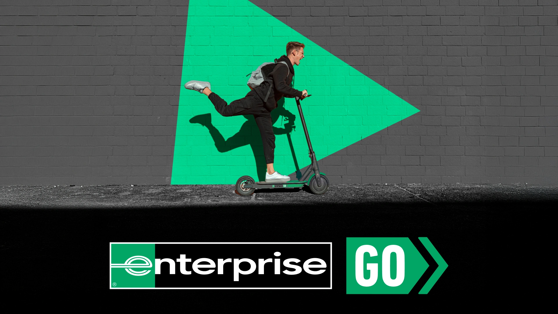
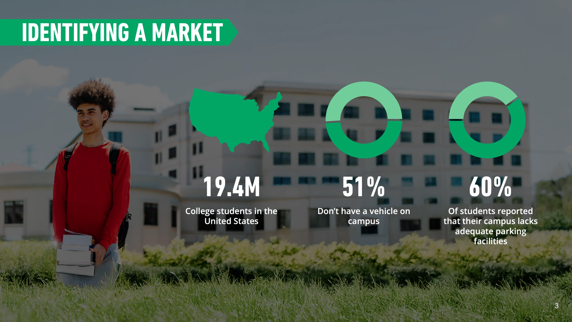
Enterprise GO was a reaction to what we as a group saw in the marketing department – a lack of marketing towards college-aged adults. Because many college-aged adults cannot rent a vehicle, as the minimum age is 21 (with a fee), there simply isn’t the same connection to the brand as an older adult would have. We proposed Enterprise GO as an entirely new line of business that would insert itself into students’ campus commute, providing low-cost electric scooter services on college campuses. This gives students an on-ramp to connection with Enterprise, and makes them more likely to choose their services in the future.
Enterprise is extremely protective of their brand, logo, and assets (for good reason), and being able to create something entirely new with a different voice than other Enterprise offerings was a real excitement for me as a designer. After working with the brand guidelines for so long, breaking the rules a little bit to make something awesome felt great!
For the general feel, I wanted to riff on the new brand guidelines for the Here For It campaign, which launched the day I arrived. It was a breath of fresh air that I thought could be tweaked for a younger audience – It needed to be flexible and fun. Enterprise uses the visual language of road signs, so that’s what I focused on in my sketches.
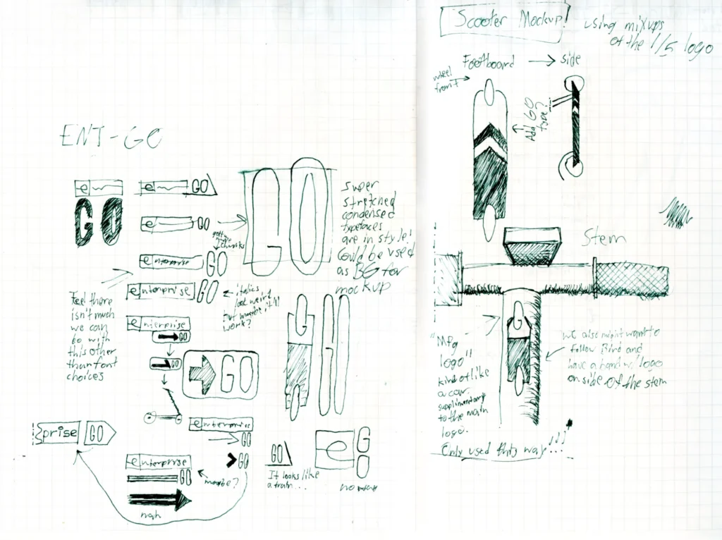
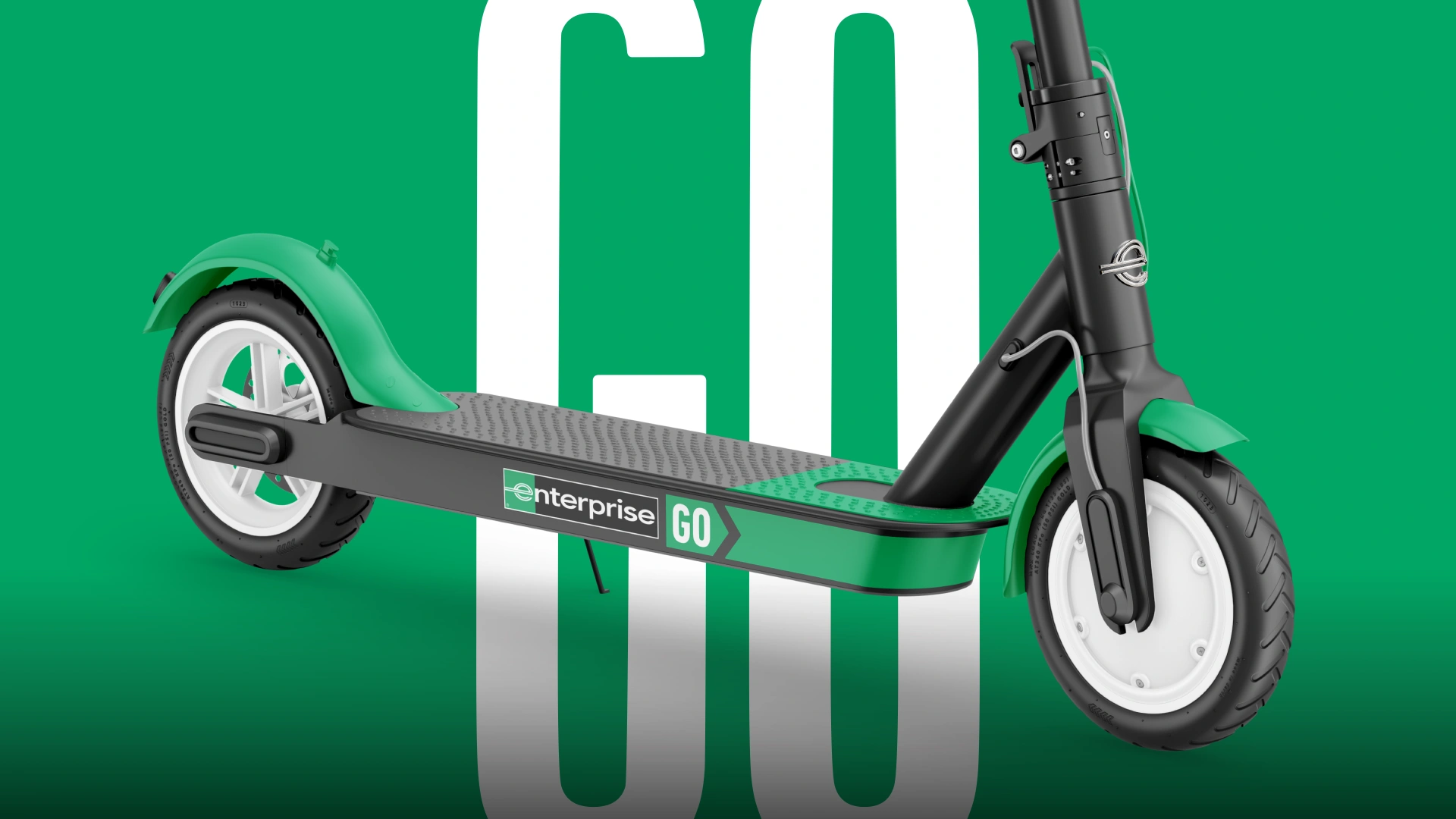
For most of Enterprise’s logos for their various lines of business, I saw a lack of forward motion, save for its iconic “e.” I wanted a sense of spontaneity and flexibility to differentiate Enterprise GO from Enterprise’s other lines of business, so I used the imagery of a chevron sign you’d see on the road. It’s easily recognizable, and something that I think hits the mark. It also takes the “GO” and turns it into a call to action, rather than a simple name.
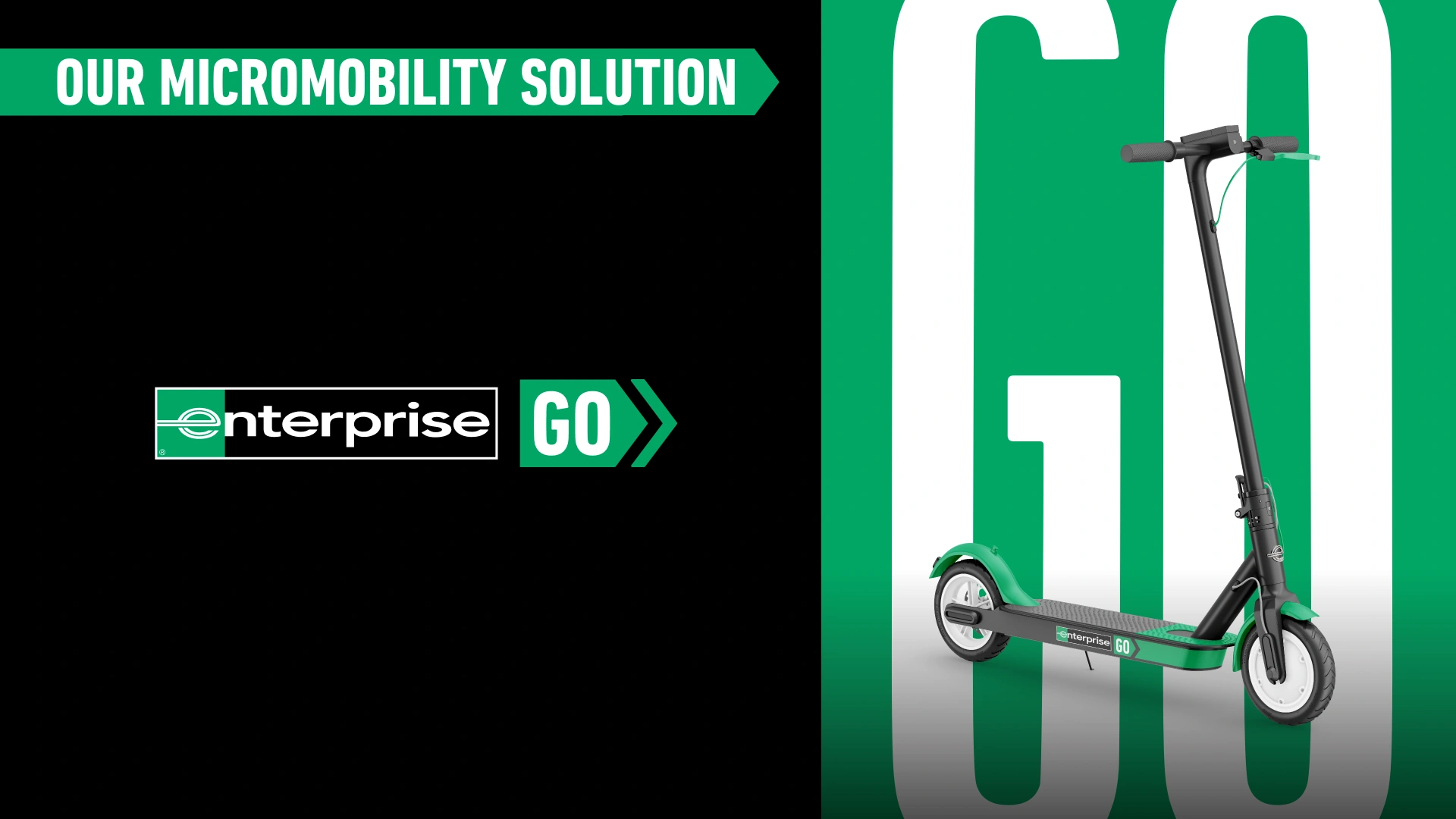
While I didn’t have the time to flesh out an entire system for this branding, I thought the use of stretched type (seen in the closeup shots of the scooter) would feel energetic and call to the flexibility of having e-scooters on a college campus. I intended to have this stretched type used all over, as either a background element that adds both texture and meaning to a blank background, or a header that gives extreme emphasis.
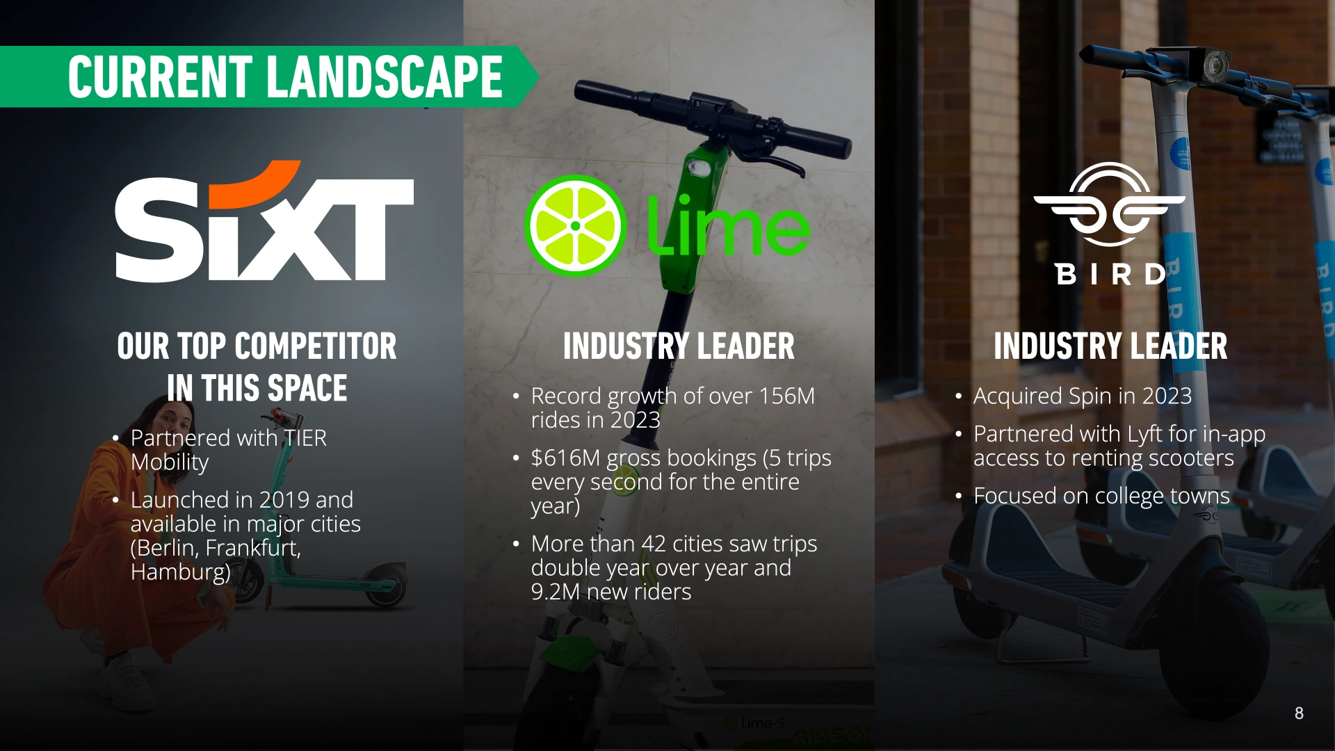
The element I spent the most time on was the scooter livery – where I think that paying attention to small details truly paid off. The base mockup was one I found online, but for what I was doing it had to be modified and extended so that I could edit it as I wanted. I left the deck and brake fairly simple, reserving the chevron only for the logo stretched around the bottom. Using Blender, I added a chrome “e” to the front, inspired by hood ornaments. The other stock images in the presentation were specifically chosen because they used the exact model of scooter in the mockup, and I spent a lot of time editing them to ensure consistency throughout the presentation.
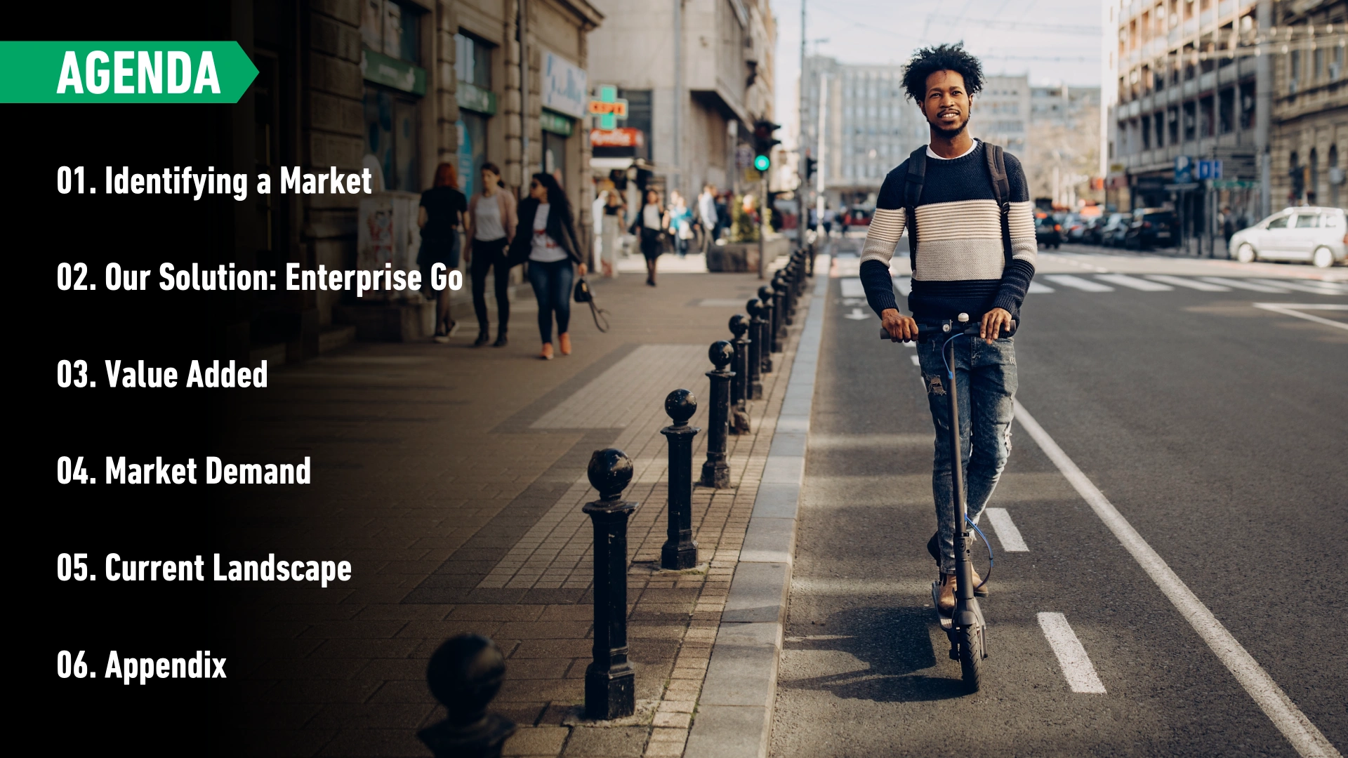
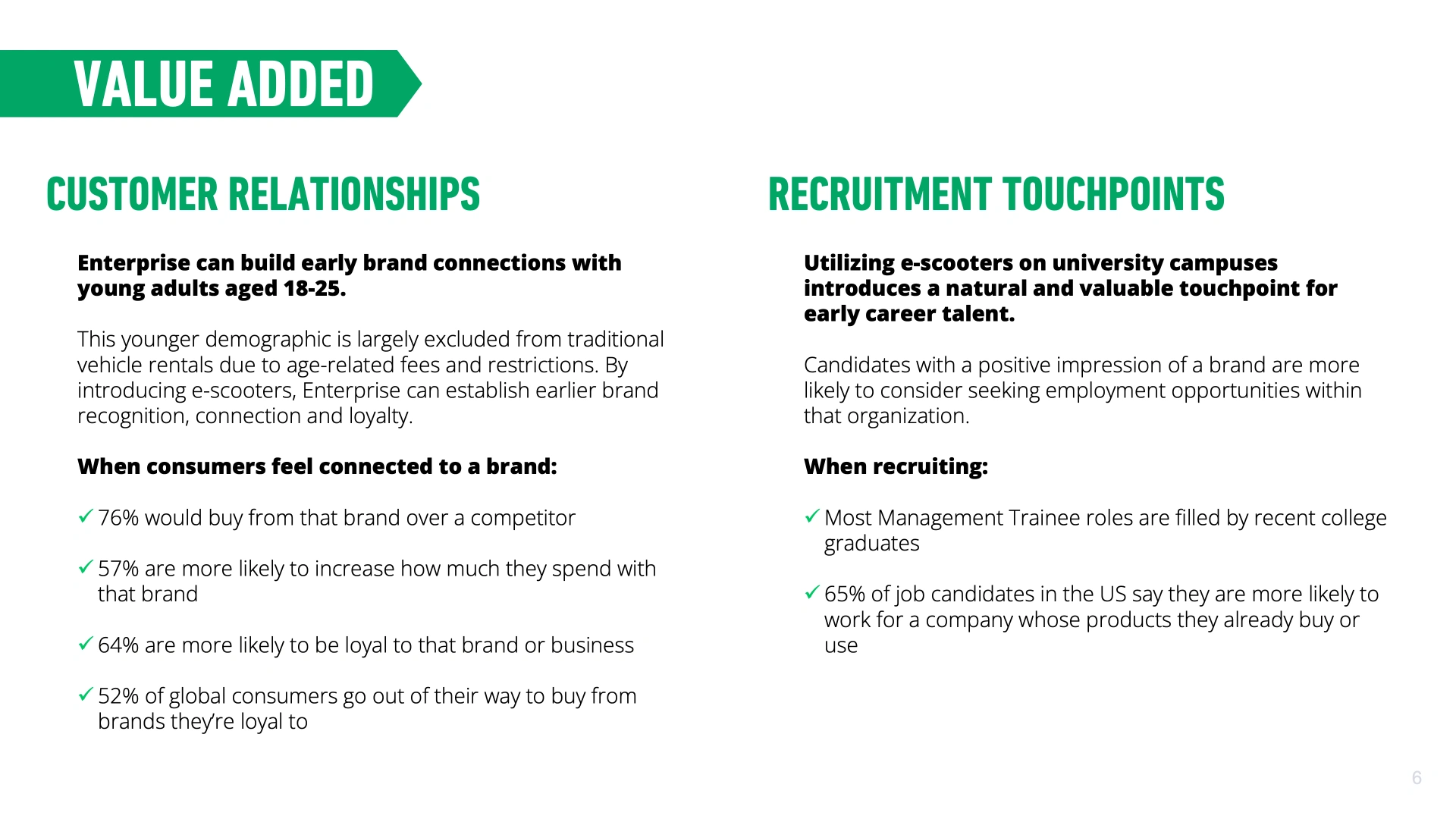
The rest of the presentation design followed the “Here For It” brand guidelines, and was pretty simple to put together. I added the chevron to the headers to give them more emphasis and tie the design more closely to the logo.
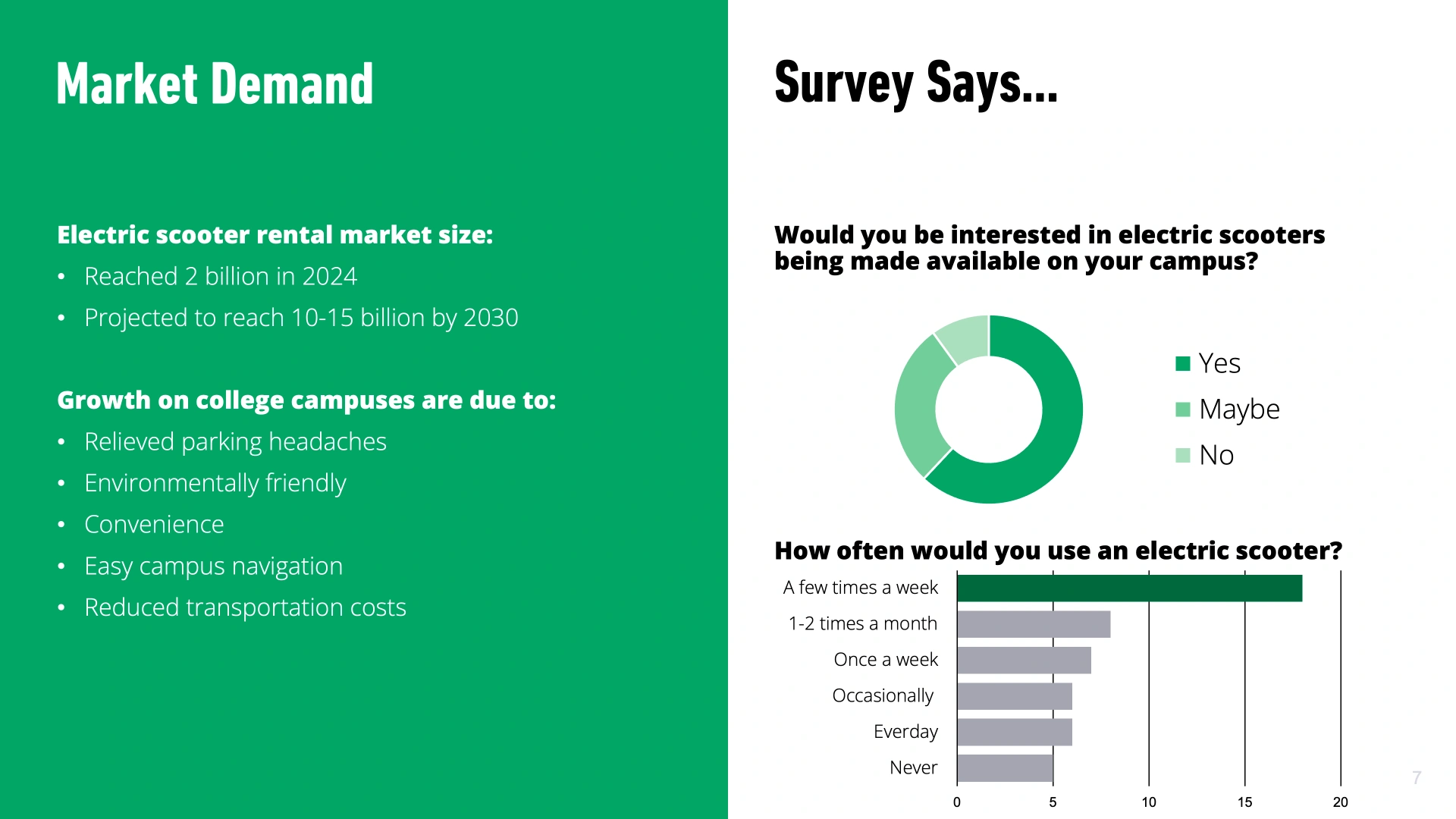
When it came to the presentation itself, our team ended up winning! I think what made ours rise above the others was that our team’s market research, analysis of potential viability, and attention to the branding and design made it seem like less of a proposal – this looked ready to launch. This was an extremely rewarding project to close out my internship, and one I’m proud to have in my portfolio.