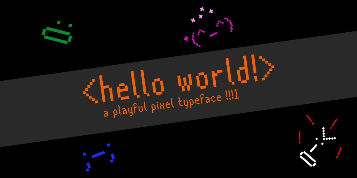
Hello world! Are you there?
View Glyphs
A
B
C
D
E
F
G
H
I
J
K
L
M
N
O
P
Q
R
S
T
U
V
W
X
Y
Z
a
b
c
d
e
f
g
h
i
j
k
l
m
n
o
p
q
r
s
t
u
v
w
x
y
z
1
2
3
4
5
6
7
8
9
0
!
@
#
$
%
^
&
*
(
)
–
_
=
+
[
]
{
}
\
/
;
:
‘
“
<
>
,
.
?
|
This is the first (real) font I’ve ever made, for my Typography I class. We were told to make a modular typeface, starting with the letters A, E, N, G, S, and 2. At first, I interpreted the assignment to be a whole lot more as it was, and started to sketch out letters that looked like this:
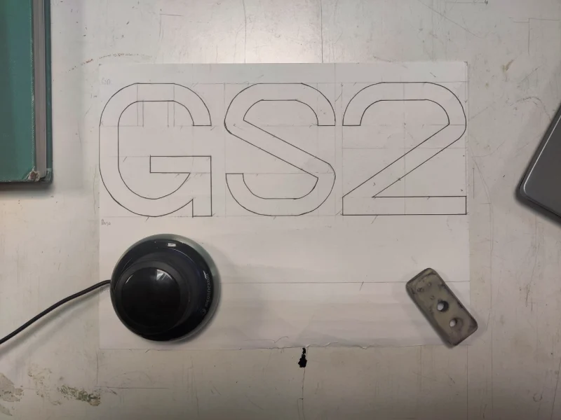
I really wanted to focus on the module on the left, and I thought it would end up being a really good looking sans-serif typeface. But, unfortunately, the reality of the time constraint got to me, and I decided to pivot to something simpler. I definitely want to continue with this someday when I have more time!
Moving to pixels
In order to make a typeface a little quicker, I decided to make a condensed sans-serif pixel typeface on a 4×10 grid. I’ve always thought that bitmap fonts like Mojangles and GNU Unifont had a really neat charm to them that reminds me of when computers were still in their infancy. When I first started using computers, sometimes I would open up Microsoft Word and check out which fonts were still legible at the smallest sizes, so I wanted to make something that accomplished that as well as having the charm of early computing.
I first began with the A, E, N, G, S, and 2, using a template I made previously in Affinity Designer.

From these letters, I was able to take out small modules and use them with other characters. For example, the E can be turned into a bunch of different letters, like F, O, C, J, B , and R. I was able to do that with all of these letters, building out the full uppercase set and the numbers.
I wasn’t able to fully conform to my 4 x 10 grid, sometimes extending it to 5 x 10 for M, W, V, X, Y, and 6. At 4 x 10, M, W, and V were illegible, and X and Y were difficult to look at. The 6 required a more rounded bottom to help more easily distinguish it from the 8.
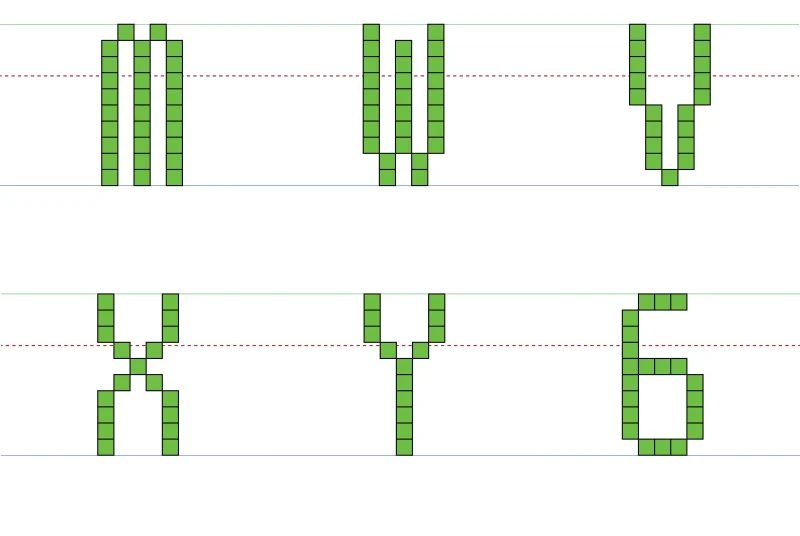
The lowercase symbols went through a similar process, with making the base letters and extrapolating their features to the others. The symbols were pretty challenging and I had to throw the 4 x 10 grid out of the window for most characters, but I had a lot of fun making them. Below are my two favorite characters in the whole set.
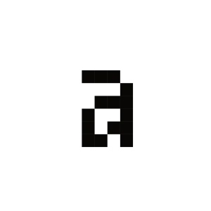
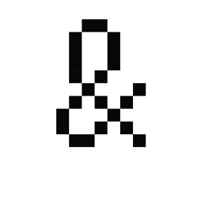
These were the most troublesome characters in the whole typeface for me. It took quite a bit of tweaking to make the two-story “a” look right while trying my best to conform to the 4 x 10 grid. I originally made a single-story “a”, but it seemed out of place for these kinds of pixel fonts. The ampersand also took a lot of work, especially with balancing the sizes of both counters and seeing how I could avoid pushing too far out of my grid constraint.
After I was all finished, I threw all my exported SVG files into FontForge and adjusted the kerning. I didn’t add hinting like many other fonts have, because I noticed that the typeface looked blurry when scaled down to miniscule sizes. On a screen, it looks like the absolute minimum that Hello World can be scaled to is 8pt without any blending of strokes. Any smaller, and the lines of characters like W and M tend to start blending together.