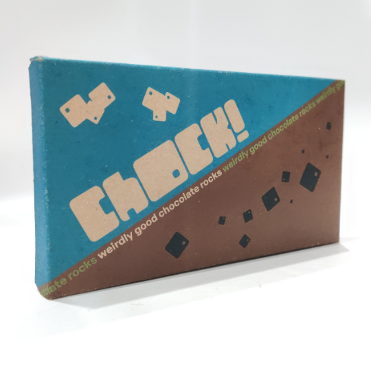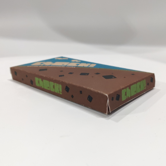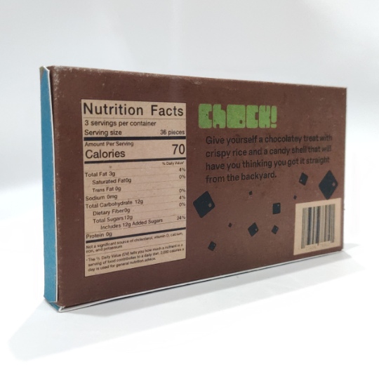
This candy box was for my Print Design and Production class. It was an exercise in packaging design and setting up a file to be ready to print, cut, fold, and glue together.
The dimensions and design of the box itself was taken directly from a box of Nerds candy, but I found that making the unfolded box in Illustrator is quite difficult and tedious when trying to get every dimension correct. So, I opened up my copy of FreeCAD and made a sketch with all the correct dimensions, which was easy to import into Illustrator.
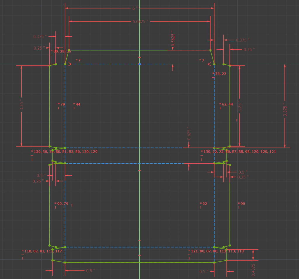
Another advantage of this is that I am able to easily adjust the dimensions. If I ever need another box, I can simply enter the dimensions of the box into the design spreadsheet and export a new dieline.
Inspiration
The box of Nerds brought me into an interesting rabbit hole when looking at the style of candy packaging that I wanted to do. Nerds is in a class of candy that is somewhat adjacent to the cheaper classes of candy. Some examples of this kind of candy would be Fun Dip, Pop Rocks, and Milk Duds, where their packaging has a really neat charm but is printed as cheap as humanly possible. I then decided to give an identity to a cheap candy that seemed to never have one – chocolate rocks.
Making Chocolate Rocks Look Good
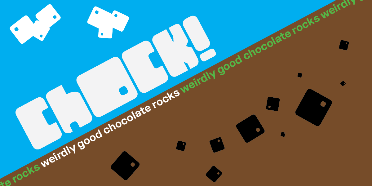
I had the idea to have a nature theme for my box, and as it turned out we also had a pretty big supply of craft paper in the print lab, which gave the impression that the box was made of recycled paper. I decided to use the natural brown color of the paper to represent soil, and made a design around that look. I was able to use a variable typeface to give each letter a different width, and duplicated the ‘O’ to represent the rocks in the ground and clouds in the sky. I was also able to repeat the “weirdly good chocolate rocks” tagline to represent the grass.
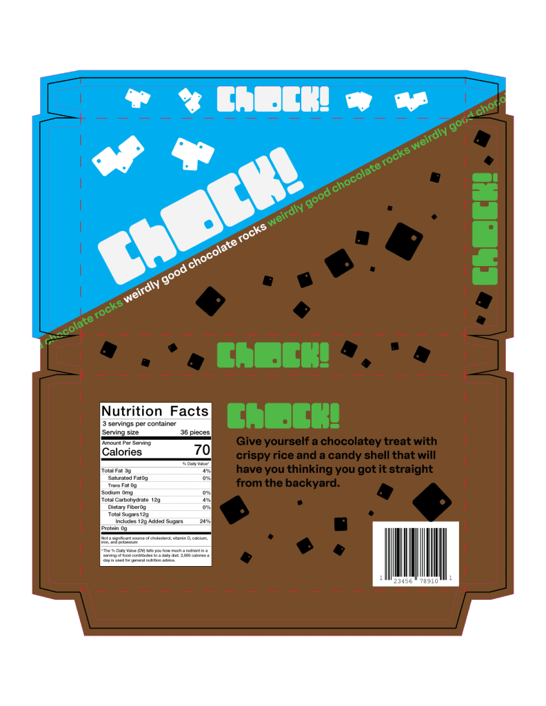
I thought this box turned out really well, considering it was one of my only times doing packaging design. It has a super unique feel when held in the hand!
